fieldnotes 12
.png)
Fieldnotes #12
How is it already July?!
Remember, as always, you're free to just scroll down and snag this month's freebie! You know I won't judge! 😉
.png)
Bon Jovi, Me, & Zazzle 🤘🏻
We watched a Bon Jovi* documentary last month and I couldn’t stop thinking about how Jon Bon Jovi basically willed that band into success. He was focused, strategic, and he treated it like a long game, even when the other band members were distracted by fame.
It made me think: how often do we start a shop like it’s a dream (livin’ on a prayer, anyone? 🤘🏻) but then stall out because we treat it like a hobby?
The key, I think, is something I’ll call CEO Energy (yep, I’m making words up now! LOL). CEO Energy isn’t the hustle that leads to burnout, but rather it’s the clarity, consistency, and long-game mindset that leads to a decades long business rather than a “one-hit wonder.”
⚡So here’s your mindset reminder for July: Success rarely feels glamorous, and in fact it’s often boring. For Jon, it was showing up solo to interviews, writing songs in the background, and making unpopular decisions that kept the band afloat.
For us, it’s things like researching a design before making it (you know who you are 🙈😅), uploading one more product, checking tags, or learning instead of scrolling. We all love the creative side of this business, but without structure, burnout or drifting is inevitable, and neither of those are profitable. Of course, not every day has to be a power ballad. But you do have to keep showing up, because that’s where progress starts to build. 💪🏻
Also? I was shocked at how much early Bon Jovi sounded like Springsteen! Those first albums were full-on heartland rock - straight up New Jersey vibes! It was good stuff, but Bon Jovi’s real breakthrough came when they found their own sound.
So here’s a bonus takeaway: Sometimes we start out mimicking bestsellers or chasing trends, but the real magic happens when we find our own twist on what’s popular and then lean into what makes us unique. Your weird little ideas might just be the thing that helps you stand out. (Just... don’t get too weird. 😂)
*p.s. After I wrote this, it occurred to me that not everyone knows who Bon Jovi is. You probably figured it out already, but they were an American rock band that started in the 80’s.
.png)
Updates & Improvements
Zazzle has taken a page out of Canva’s book (yet again! 🙈) and added fillable shapes (masks), frames, and GRIDS! I mentioned the shapes (masks) last month, and they are cool enough on their own. But the addition of the addition of the frames and grids is phenomenal and is going to be a HUGE help to those of us (which should be all of us, but you do you 😅) who do photo-based cards and gifts.
If you want to get a quick idea of how they work, my friend Lisa of Happy Zazzling has made a great, short video introducing them and showing you the basics. You can watch it here: https://www.youtube.com/watch?v=rDKVLDMyPOs
From there you can just go in and play around.
Here are a few things I noticed that you might not think of right away:
⚡They look like fixed shapes, but they’re really not. I mean the grid shape is static - if it’s one large frame and 2 small ones, you can’t get rid of one of them or resize them individually. The whole thing moves as a unit.
⚡However, you CAN adjust the aspect ratio of the whole thing. When you first add a grid it will adjust itself to fit the product space (square, rectangle). Lisa goes over this in her video, but it bears repeating.
⚡You can adjust the spacing between the grids as well as the “corner radius”. Try playing around with it a bit - adjust the corner radius a little and then a lot to see what happens. Then adjust your aspect ratio a bit (grab the grid from one of the sides or tops, not the corners) and watch how your grids change size.
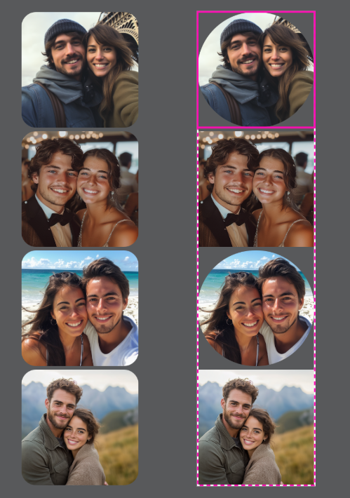
⚡Which brings me to my favorite thing so far: You CAN adjust the corner radius of each item in the grid independently! So the grid that started as squares can end up with squares, ovals, even circles! Just double-click on the grid you want to adjust, then change the radius and hit enter.
Check out the screenshot below. On the left is what you get if you click the whole grid and change the radius - see how they’re all the same size? On the right is what you get if you double-click the grids to make independent changes. You can see that I changed the 1st and 3rd grids to circles there. Pretty cool!
✨One VERY important reminder, though, is that if you use one of Zazzle’s FRAMES or GRIDS, you need to make your template fields AFTER you put the photo in the frame/grid.
But If you use their SHAPES (or any of the shapes from our Toolkits, or any of your own SVG shapes), you can add the template field either before or after.
It's easy to tell the difference, because the FRAMES and GRIDS have that green landscape image inside them; the SHAPES are just gray.
What should you be creating right now?
Like I said, we are on the cusp of the holiday season (for designers), but for now we are wrapping up Summer and moving onto Fall.
Fall is coming up fast (only 12 Fridays until Autumn!), so focus on:
🍂Fall Weddings & Fall Themed Baby Showers
🍂Thanksgiving (and Friendsgiving)
🍂Winter Holidays (including Christmas in July!)
What should you be promoting right now?
💍Summer Weddings and Events
🎒Back to School
💍Summer Weddings and Events
🎒Back to School
.png)
This month’s freebie comes with a lesson first. Yep - you have to eat your vegetables before you can have dessert! 🤣
Let's talk about Sunflowers!🌻
Now, in truth, I haven’t made sunflower designs because honestly, I don’t love them. 😅 But the fact is, sunflowers sell! They are an evergreen design style, and people come back to them year after year, especially in certain niches (I’m talking to you, Rustic Farmhouse, LOL).
It’s also tough to find or create sunflower graphics that don’t look exactly like all the others, but that also don’t go so far in the other direction that they lose their charm. 😬
But I do believe that it is possible to shine (like a sunflower) in the sunflower niche, but you’ll need to be strategic. We’ll get to that in a minute. First, let’s just talk about what’s going on with sunflowers right now.
Style Matters:
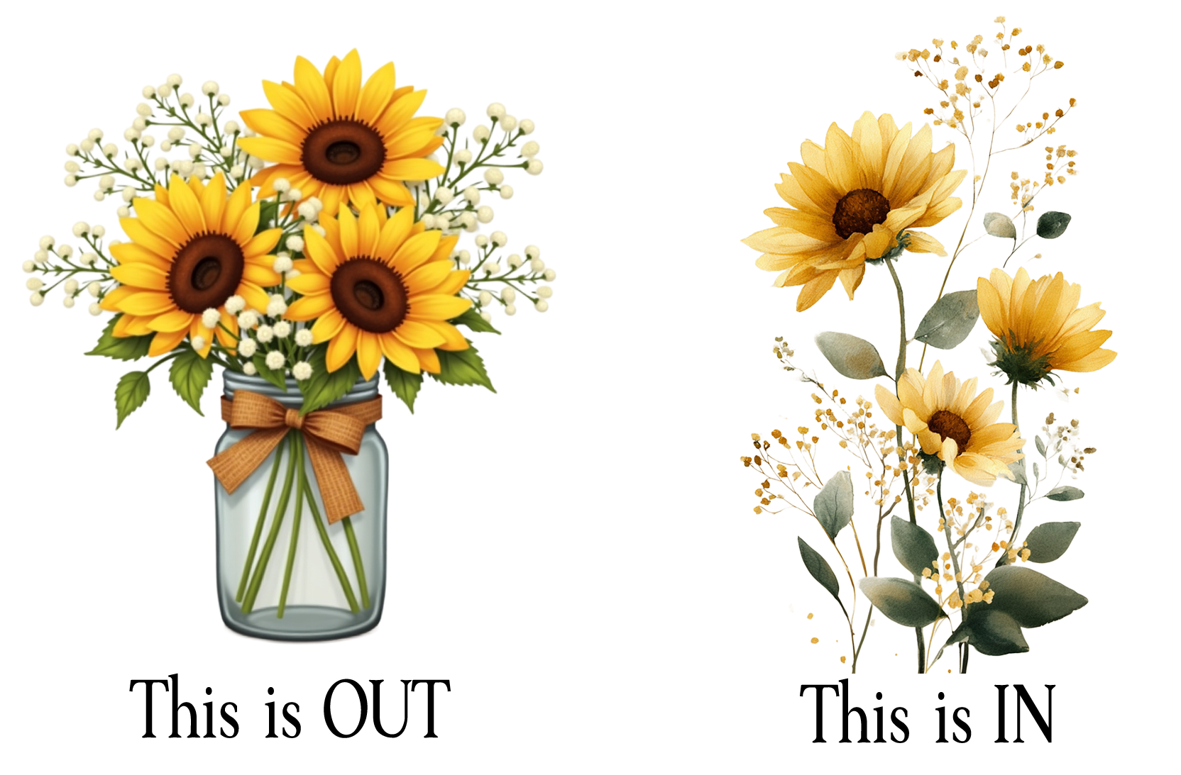
Traditional/Older designs use the sunflower as the main focus. They use bold, saturated colors with that classic “digital watercolor” vibe. The traditional look still dominates the front page of search results (and still sells!), but a lot of those designs are 3-5 years old, so they’re ranking well partly because they’ve been there forever. If you go this route, you’re not only going to have a lot more competition, but you’ll also be getting into a design style that is losing traction.
Modern/Newer designs use sunflowers more subtly. They include things like looser brushstrokes, softer palettes, and a more hand-painted, organic feel. They do not have the “digital” look to them at all. We’re seeing more of these modern, looser styles creep onto page one, and most of those are less than two years old; some are mere MONTHS old!
Niche makes a difference when choosing a style:
Elegant occasions tend to lean toward the modern, softer sunflower designs.
Rustic or country events still love the bold, chunky look. An important note here, though, is that the “digital art” look (shiny, clip-artish, almost cartoony style) is fading fast, even in the rustic niche. You still want to lean into the hand painted look over the computer-generated look.
What sells well:
Most top-selling designs include more than just sunflowers. Even in “sunflower” listings, you’ll often see extra floral elements (for color contrast), greenery, or rustic accents like string lights or wood backgrounds.
If you’re creating in the traditional style, find ways to differentiate-like using unexpected color pairings, mixed florals, or layered textures. Don’t rely on the sunflower alone to carry the design.
What’s trending down:
That classic combo-sunflowers + wood + lace + string lights + burlap-is starting to feel tired. It had its moment in the early 2020s (yes, those early twenties-sorry if that made you feel ancient 😄).
It can still work in specific regions (think southern U.S.) or casual events, but it’s edging into cliché territory. If you still love this vibe, modernize it: swap in lighter wood tones, airy greenery, and looser floral compositions.
Fonts matter. A LOT.
Sunflowers are big, bold, and yellow. If you pair them with too many fussy, swirly fonts you risk a visual shouting match. Clean sans serifs or modern serifs create breathing room and make your design feel balanced. Contrast is key with sunflowers: Let the sunflower be the drama queen; don’t let your fonts compete for attention.
So this month, I’m giving you a FREE mini pack from an upcoming Toolkit (yes, keep an eye out - it’s happening!). It has 3 perfectly lovely sunflower graphics, a beautiful seamless pattern, and your Inspiration Brief with tags, niches, and even font pairings! Click here or on the graphic below to grab it and get to work!
.png)
.png)
I don’t have any Field Tested Finds this month, so we’ll introduce a new section called “Kate’s Mistakes.” 🤣
Every now and then, I mess something up just enough to be educational (and maybe a little face-palm worthy). When that happens, you’ll find it here - along with what I learned (so you don’t have to repeat it).
If you read the Zazzle Forums (ew!), I posted about this there, but I want to tell you here, too. So, I made four table cards for a friend’s wedding-same product, same design style, just different table numbers. I set them all at 10% royalty and used direct links so she could order easily.
When the sale came through, I noticed something strange: one of the cards earned me more money (both in royalty and referral) than the other three, even though I had used the same exact setup and made them all using the same template.
Naturally, I went digging.
Turns out, one of them had landed in a different Marketplace department. Three were listed under Party Supplies, but one ended up under Weddings > Day-of Stationery. That one change meant a higher referral rate and a slightly better royalty (to get my total up to the max amount).
Now, to be fair, I don’t know if I accidentally selected the wrong category when I was flying through setup... or if Zazzle nudged one of them based on keywords or vibes. Either way, I wasn’t paying close attention, and that tiny difference ended up changing my payout.
🙈Lesson learned: Marketplace department matters a lot more with the new royalty/referral system. And when you’re using one product as a base to create others, it’s easy to assume they’ll all stay in the same department, but they don’t always do that.
So if you’re making variations or choosing alternate departments to help with visibility (for example, listing a bridal shower game under Weddings instead of Party Supplies), it’s worth double-checking where your products are actually landing. That department choice can change your referral rate, and even a small mismatch can quietly impact your earnings.
That being said, this isn’t about trying to game the system. Don’t go dumping everything into the Weddings category just because it pays better. But if your product is wedding-related (or even wedding-adjacent) and you’ve been defaulting to Party Supplies out of habit, this is your reminder to rethink that.
♥ That's it for July! ♥
If you're in the USA, I hope you enjoy a wonderful, safe 4th of July!
(And Happy Canada Day to you northerners! )
Thanks for being here - I appreciate you! ♥
Be sure to reach out if you have questions or just want to say hi!
If you're in the USA, I hope you enjoy a wonderful, safe 4th of July!
(And Happy Canada Day to you northerners! )
Thanks for being here - I appreciate you! ♥
Be sure to reach out if you have questions or just want to say hi!
.png)